
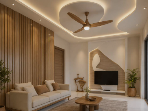
Ceilings can have a major influence on the character and atmosphere of an interior, yet they are often overlooked during room planning. A well-designed ceiling can add visual depth, highlight architectural features, improve lighting, and create a stronger connection between different elements of a room. A decorative ceiling can range from simple layered details to more elaborate patterns, depending on the size and style of the space. Materials, colors, lighting, ceiling height, and furniture placement all contribute to the final appearance. With thoughtful planning, the ceiling can become an attractive part of the room without making the design feel excessive or visually crowded. Understanding Decorative Ceiling Design A decorative ceiling is more than a basic overhead surface. It can include architectural details such as recessed sections, beams, panels, molding, layered surfaces, or integrated lighting. The design should complement the room rather than compete with furniture, flooring, wall finishes, and other features. Simple details can be especially effective in smaller rooms where excessive decoration may make the space feel confined. Choosing a Ceiling Style The appropriate ceiling style depends on the architecture and purpose of the room. Contemporary interiors may benefit from clean geometric forms, while traditional spaces can accommodate molding, panels, or ornamental details. The ceiling should also relate to the home’s overall design language. Using a consistent approach throughout connected spaces can create a more cohesive appearance. Using Tray Ceilings Tray ceilings create a recessed center section surrounded by a raised border. This design can add depth without requiring extremely complicated construction. Lighting can be installed along the edges to emphasize the change in levels. The central section can also use a contrasting paint color or subtle texture to create additional visual interest. Considering Coffered Ceilings Coffered ceilings use recessed panels arranged in a grid or geometric pattern. They can provide a strong architectural presence in dining rooms, studies, living rooms, and larger bedrooms. The size of the individual panels should correspond to the dimensions of the room. Oversized patterns can appear unbalanced in smaller spaces, while very small panels may create unnecessary visual complexity. Adding Ceiling Beams Exposed or decorative beams can introduce warmth and structure to a room. Wood-look beams can suit rustic, farmhouse, transitional, or contemporary interiors depending on their shape and finish. Beams should be positioned carefully so that they do not make the ceiling feel lower than it actually is. Their dimensions should also work with the room’s proportions. Using Ceiling Panels Decorative panels can create texture and rhythm across a ceiling. They can be made from different materials, including wood, gypsum-based products, or other interior finishing materials. Panels can cover an entire ceiling or be limited to a central feature. A restrained pattern can provide visual interest without overwhelming the room. Integrating Lighting Lighting is one of the most important parts of ceiling design. Recessed fixtures, pendant lights, concealed LED strips, chandeliers, and surface-mounted fixtures can all be incorporated into the overall layout. Rather than adding lights after the ceiling design is complete, fixture locations should be planned at the same time. This helps maintain symmetry and prevents awkward placement. Creating Layered Lighting A ceiling can support several lighting levels. General illumination can provide overall brightness, while accent lighting can highlight artwork, architectural details, or specific areas. Indirect lighting around recessed sections can create a softer glow. Combining several sources gives homeowners greater control over the atmosphere of the room. Choosing the Right Ceiling Color White is a common ceiling color because it reflects light and can make a room feel open. However, other shades can create distinctive effects. Soft neutral colors can provide warmth, while darker tones can add drama in rooms with sufficient height and lighting. The selected color should work with the walls, flooring, furniture, and natural light. Considering Ceiling Height Ceiling height strongly influences which decorative features will work well. Taller ceilings can accommodate beams, layered structures, and larger decorative elements. Rooms with lower ceilings generally benefit from simpler designs. Excessively deep recesses or heavy beams can make such spaces feel smaller. Using Molding and Trim Crown molding and other trim details can provide a finished transition between walls and ceilings. Simple profiles can suit modern interiors, while more elaborate molding can complement traditional architecture. The width and profile should correspond to the scale of the room. Very large trim can appear disproportionate in compact spaces. Adding Texture Texture can make a ceiling visually interesting without requiring complex architectural changes. Subtle plaster effects, wood finishes, patterned panels, or textured paint can all create different impressions. The texture should be selected according to the room’s lighting because shadows can make surface irregularities more noticeable. Designing a Living Room Ceiling The living room is often an ideal place for a ceiling feature because it is one of the most frequently used shared spaces. A tray ceiling, central panel, or recessed lighting arrangement can define the seating area. The ceiling design should coordinate with the main furniture arrangement. A central light fixture can be positioned above a coffee table or seating zone to create visual balance. Planning a Bedroom Ceiling Bedrooms usually benefit from softer and less visually demanding ceiling designs. A recessed center with concealed lighting can create a calm atmosphere. Decorative details should not interfere with ceiling fans, pendant lights, air-conditioning equipment, or other necessary fixtures. These elements should be considered during the initial design stage. Designing a Dining Room Ceiling A dining room can accommodate a stronger ceiling feature, particularly above the dining table. A central recessed panel or decorative border can visually define the eating area. A pendant light or chandelier can become the central feature, with the ceiling design supporting rather than competing with it. Considering Kitchen Ceilings Kitchen ceilings need to balance appearance with practical requirements. Lighting, ventilation, exhaust systems, cabinets, and other services may influence the available space. A simple recessed border or carefully positioned lighting can add character without interfering with kitchen functionality. Using Wood Elements Wood can add warmth and natural texture
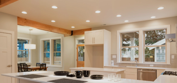
LED Retrofit Recessed Can Lights for Modern Home Lighting
Good lighting can change how a room looks, feels, and functions. Recessed fixtures are popular because they provide illumination without taking up visual space on ceilings. For homeowners updating existing lighting, led retrofit recessed can lights can offer a practical way to replace older recessed bulbs or fixtures while using modern LED technology. These lights can work in living rooms, kitchens, bedrooms, hallways, offices, and other areas where a streamlined ceiling appearance is preferred. Before installation, it is important to consider the existing housing, fixture size, brightness, color temperature, dimming compatibility, and ceiling conditions. Understanding these details can help create consistent lighting throughout the home. Understanding Retrofit Recessed Lighting Retrofit recessed lighting is designed to update an existing recessed light housing rather than requiring an entirely new ceiling opening in many installations. This approach can be useful during remodeling projects because the existing housing may already provide the necessary structure. The new lighting component can update the appearance and performance of the fixture while reducing the amount of ceiling work required. Why LED Lighting Is Popular LED technology has become common in residential lighting because it can provide strong illumination while using relatively little electricity. LED fixtures are also available in various brightness levels and color temperatures. Their long operating life can reduce the frequency of bulb replacement. This can be particularly convenient for ceiling fixtures installed in tall rooms or difficult-to-reach areas. Checking Existing Recessed Housings Before selecting a retrofit product, homeowners should identify the size and type of the existing recessed housing. Common dimensions include several standard sizes, but compatibility varies between fixtures. The housing should be checked for its shape, mounting method, electrical connections, and other specifications. Choosing a fixture designed for the existing housing can simplify installation. Selecting the Right Light Size Recessed lighting is commonly available in different diameters. The appropriate size depends on the existing opening and the desired visual effect. Smaller fixtures can provide a more discreet appearance, while larger fixtures may distribute light across a broader area. The spacing between fixtures should also be considered when planning multiple lights. Choosing the Brightness Brightness is usually measured in lumens rather than simply wattage. The appropriate lumen output depends on the room’s size, ceiling height, wall finishes, and intended use. A kitchen workspace may require stronger illumination than a bedroom, while hallways can often use lower levels. Using the same brightness throughout the home is not always necessary. Selecting Color Temperature Color temperature affects the atmosphere created by the lighting. Warm white light can provide a comfortable residential feel, while neutral white can appear brighter and more balanced in work areas. Cooler light may be suitable for certain task-oriented spaces, but it can appear harsh in rooms intended for relaxation. Selecting a consistent temperature across connected areas can improve the overall visual experience. Considering Dimmable Fixtures Dimming provides flexibility by allowing homeowners to adjust light levels according to the time of day and activity. If dimming is important, both the retrofit fixture and the wall dimmer should be compatible. Not every LED product works correctly with every dimming system, so compatibility information should be checked before installation. Improving Kitchen Lighting Recessed lighting is commonly used in kitchens because it can provide general illumination without interfering with cabinets or hanging fixtures. Lights should be positioned to illuminate countertops and work areas rather than simply being arranged in the center of the ceiling. Combining recessed fixtures with under-cabinet lighting can further improve task visibility. Using Recessed Lighting in Living Rooms Living rooms often benefit from flexible lighting arrangements. Recessed fixtures can provide general illumination while table lamps, floor lamps, and decorative fixtures create additional layers. Spacing should be planned according to furniture placement and the room’s main activity areas. Excessive fixtures can make the ceiling look crowded and produce unnecessary brightness. Planning Bedroom Lighting Bedrooms generally benefit from softer and more adjustable lighting. Dimmable recessed fixtures can allow brighter illumination when needed and lower light levels during relaxing periods. Fixtures should be positioned carefully so that they do not shine directly into the eyes of someone lying in bed. Bedside lighting can provide a more comfortable alternative for reading. Using Lighting in Hallways Hallways can use recessed lights to create consistent illumination along circulation paths. The number of fixtures depends on ceiling height, hallway length, fixture brightness, and desired spacing. A continuous pattern can create a balanced appearance, while fewer strategically placed fixtures can provide a more subtle effect. Considering Ceiling Height Ceiling height influences both fixture placement and light distribution. Higher ceilings may require stronger illumination or fixtures with appropriate beam angles to deliver light effectively. Lower ceilings may benefit from smaller, low-profile fixtures that preserve visual openness. The fixture should complement the scale of the room. Understanding Beam Angles Beam angle describes how widely light spreads from a fixture. A narrow beam can concentrate light in a specific location, while a wider beam can illuminate a larger area. The ideal beam angle depends on the purpose of the fixture. Task areas may benefit from more focused illumination, while general room lighting often works better with broader distribution. Creating Layers of Light Recessed lighting does not have to perform every lighting function in a room. A layered design can combine general, task, and accent lighting. Pendant fixtures, wall sconces, cabinet lights, lamps, and recessed fixtures can each serve different purposes. This approach allows homeowners to adjust the atmosphere and brightness more easily. Considering Energy Use Replacing older lighting with LED technology can reduce electricity consumption depending on the original fixture and usage pattern. The actual energy savings depend on factors such as wattage, operating hours, number of fixtures, and local electricity rates. Choosing efficient products can contribute to lower long-term operating costs. Checking Insulation Compatibility Ceiling insulation can affect recessed lighting installation. Some housings have specific requirements regarding insulation contact and clearance. The retrofit fixture should be appropriate for the existing housing and ceiling conditions. Product installation instructions should always be reviewed before fitting
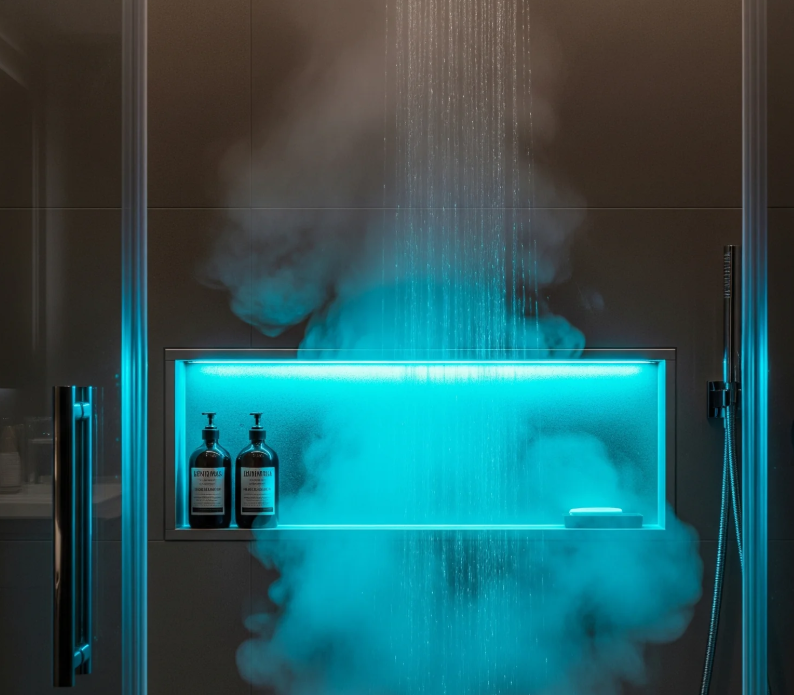
Lighted Shower Niche Ideas for a Modern Bathroom
Bathroom design is increasingly focused on combining convenience with attractive details that make everyday routines easier. A shower niche can provide an organized place for shampoos, soaps, and other essentials while reducing clutter around the shower floor. A lighted shower niche adds another layer of functionality by bringing focused illumination to this storage area. It can also create a soft visual feature that complements wall tiles and other bathroom finishes. When planning one, homeowners should consider the niche size, location, waterproofing, lighting type, electrical requirements, tile layout, and overall bathroom style. Careful planning can create a useful feature that looks integrated rather than added as an afterthought. Understanding Shower Niches A shower niche is a recessed storage space built into a shower wall. Instead of using freestanding shelves or hanging organizers, the niche creates storage within the wall itself. Its dimensions can be customized according to the available wall space and the items that need to be stored. Some designs use one large opening, while others divide the space into several sections. Choosing the Right Location The niche should be positioned where shower products can be reached comfortably. Placing it too low can make bending inconvenient, while placing it too high may make everyday items difficult to access. The location should also be planned around plumbing, electrical components, structural framing, and the shower layout. These factors should be reviewed before construction begins. Selecting the Niche Size The ideal niche size depends on the number and type of products being stored. A household with several bottles may need a wider or taller design, while a minimalist bathroom may require only a compact compartment. The depth should also be considered. A niche that is too shallow may not hold larger containers securely, while excessive depth can reduce useful wall space. Planning the Lighting Lighting is the defining feature of this type of niche. LED strip lighting, recessed fixtures, or other suitable waterproof-rated lighting systems can be incorporated depending on the design. The light should provide enough illumination to highlight the storage area without producing uncomfortable glare. The position of the light source can influence how the shelves, bottles, and tile surfaces appear. Considering Waterproofing Because the niche is located inside a wet area, waterproofing is essential. The recessed opening, corners, joints, and surrounding wall system need appropriate moisture protection. Water should not be allowed to collect inside the niche. Proper construction techniques and a slight slope on horizontal surfaces can help direct water toward the shower area. Choosing Suitable Tiles Tile selection can turn the niche into a decorative feature. The interior can use the same tile as the surrounding shower wall for a seamless appearance or introduce a complementary material for contrast. Mosaic tiles can work well on smaller surfaces because their dimensions allow easier fitting around corners and slopes. Larger tiles can create a cleaner visual effect when the layout permits. Using LED Lighting LED technology can provide efficient illumination in a compact space. It is available in different color temperatures and formats, allowing homeowners to coordinate the niche with the bathroom’s overall lighting. The lighting system must be appropriate for wet-area use. Product specifications should be checked carefully before installation to ensure suitability for the intended location. Selecting the Light Color The color of the light can influence the atmosphere of the shower. Warm illumination can create a softer and more relaxing appearance, while neutral illumination may provide a cleaner and brighter look. The selected temperature should coordinate with the vanity, ceiling, and accent lighting so that the bathroom does not have noticeably conflicting light tones. Creating Multiple Shelves A niche can include several shelves to separate different products. Two or three compartments may make it easier to organize shampoo, conditioner, soap, skincare products, and other shower essentials. Shelf spacing should be based on the actual height of the containers rather than simply dividing the niche into equal sections. Considering Shelf Materials The shelf surface needs to tolerate regular exposure to moisture. Tile is a common option, while stone or other suitable waterproof materials can also be considered. Horizontal shelves should be designed to prevent standing water. Proper slopes and carefully finished edges can improve drainage and reduce water accumulation. Coordinating With Bathroom Decor A niche can blend into the bathroom or become an accent feature. Matching the niche tile with the surrounding walls creates a unified appearance, while contrasting colors or textures can draw attention to the recessed area. The lighting can further emphasize the chosen finish, particularly when the niche is positioned within the main visual field of the shower. Thinking About Shower Size The size of the shower enclosure influences how much wall space is available for a niche. A compact shower may benefit from a narrow vertical niche, while a larger shower can accommodate a wider horizontal design. The niche should not interfere with shower fixtures, doors, benches, or other built-in elements. Planning all components together helps avoid conflicts. Planning Around Plumbing Existing water lines can affect where a niche can safely be installed. Cutting into a wall without identifying pipes and other services can create significant problems. The niche location should therefore be coordinated with plumbing and structural elements before the wall is opened. This is particularly important during renovations. Considering Electrical Safety Any electrical component in a shower area requires careful planning. Lighting must be suitable for wet environments, and electrical installation should follow applicable local codes and safety requirements. A qualified electrician can determine the appropriate wiring, protection, switching, and fixture placement for the specific bathroom layout. Using a Separate Switch The niche lighting can be connected to the bathroom’s general lighting or controlled separately. A dedicated switch provides more control and allows the accent lighting to be used independently. Some homeowners may prefer the niche light to operate automatically with the main bathroom lights, while others may want separate control for evening use. Creating a Spa-Like Atmosphere Soft lighting inside a shower niche can contribute to a calm bathroom atmosphere.
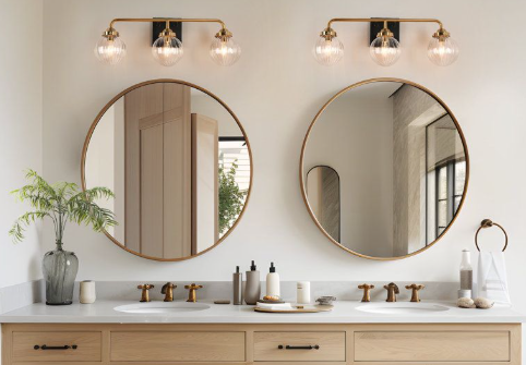
3 Bulb Vanity Light Ideas for a Stylish Bathroom
A well-designed bathroom needs lighting that combines functionality with visual appeal. The right fixture can brighten the vanity area, improve visibility around the mirror, and complement the room’s overall decor. A 3 bulb vanity light can provide balanced illumination across the mirror while adding a decorative element to the bathroom wall. It can work with different interior styles, from simple contemporary spaces to more traditional designs. When selecting a fixture, consider the mirror size, vanity width, bulb brightness, color temperature, finish, and mounting position. These details can help create comfortable lighting that supports everyday grooming while enhancing the appearance of the bathroom. Understanding Vanity Lighting Vanity lighting is primarily designed to illuminate the area around a bathroom mirror. It needs to provide useful light without producing excessive glare or uncomfortable shadows. Unlike general ceiling lighting, vanity fixtures focus illumination around the face and mirror. This makes them particularly important for activities such as shaving, applying makeup, styling hair, and other personal grooming tasks. Choosing the Right Fixture Size The size of the lighting fixture should relate to the width of the vanity and mirror. A fixture that is too small may leave portions of the mirror poorly illuminated, while an oversized fixture can dominate a compact bathroom. Before purchasing a fixture, measure the available wall space and compare it with the mirror dimensions. The proportions should look balanced from both close and distant viewpoints. Positioning the Light Above the Mirror Mounting a vanity fixture above the mirror is a common arrangement. It can provide broad illumination across the mirror area when positioned at an appropriate height. The fixture should be centered with the mirror rather than simply centered on the wall. This creates a more balanced appearance and helps direct the light where it is needed. Considering Side Lighting Side-mounted fixtures can complement or replace an overhead vanity light. Lights positioned on both sides of the mirror can reduce shadows across the face by illuminating it from multiple directions. For larger mirrors, side lighting may be especially useful because it can provide more even illumination across the full width. Wall space and electrical placement should be considered before installation. Selecting the Right Bulbs Bulb selection influences both brightness and color appearance. LED bulbs are commonly used because they provide efficient illumination and are available in different color temperatures. A neutral or moderately warm white can create a comfortable bathroom atmosphere while still providing useful visibility. The best choice depends on the room’s finishes and how the lighting will be used. Understanding Color Temperature Color temperature affects how the bathroom looks under artificial light. Warmer light can create a softer atmosphere, while cooler light can provide a brighter and more contemporary appearance. For grooming areas, a balanced color temperature can make skin tones and surrounding finishes appear more natural. Homeowners should consider how the lighting will interact with daylight entering through windows. Managing Shadows Around the Face Uneven lighting can create shadows beneath the eyes, chin, or nose. This can make grooming more difficult and can also change how colors appear in the mirror. Using multiple light sources can help distribute illumination more evenly. The placement and direction of the bulbs are just as important as the number of bulbs. Matching the Bathroom Style Vanity lighting should work with the overall design of the bathroom. Modern spaces may suit simple metal fixtures and clean lines, while traditional rooms can accommodate more decorative designs. The finish of the fixture can also coordinate with faucets, cabinet hardware, towel bars, and other details. Matching every element exactly is not necessary, but a consistent visual relationship can create a more organized appearance. Considering Mirror Size The mirror and light fixture should be considered together. A narrow mirror may need a compact fixture, while a wide mirror can benefit from a longer lighting arrangement. For double-sink vanities, the lighting strategy may need to cover both grooming positions. Multiple fixtures can sometimes provide better distribution than one small central light. Planning for Double Vanities Double vanities require careful attention to spacing and illumination. Each sink area should receive sufficient light without creating an overly bright central point. A longer fixture can illuminate both positions, while separate fixtures can provide more targeted lighting. The final choice depends on wall width, mirror arrangement, and the desired visual style. Using Dimmers A dimmer can make bathroom lighting more flexible. Bright illumination can be useful during grooming, while lower light levels may create a calmer atmosphere during evening routines. Not every fixture or bulb is compatible with every dimming system, so compatibility should be confirmed before installation. Combining Different Light Sources A vanity fixture does not necessarily need to provide all of the bathroom’s illumination. Ceiling lights, recessed fixtures, shower lighting, accent lighting, and natural daylight can work together. Layered lighting allows different areas of the bathroom to be illuminated according to their purpose. This can also prevent the vanity fixture from needing to be excessively bright. Considering Bathroom Safety Bathroom lighting needs to account for moisture and electrical safety. Fixtures should be suitable for their intended location and installed according to applicable electrical requirements. Areas close to showers, bathtubs, and other water sources may have specific requirements. Electrical work should follow local regulations and, where necessary, be completed by a qualified electrician. Choosing Energy Efficient Lighting LED technology can provide strong illumination while using relatively little energy. LEDs are also available in many shapes, sizes, and color temperatures, making them suitable for different vanity designs. Long-lasting bulbs can reduce the frequency of replacements, particularly when the fixture is installed in a difficult-to-reach location. Thinking About Maintenance Bathroom environments can expose fixtures to humidity, dust, and cosmetic residue. A simple design with accessible bulbs and surfaces can make cleaning easier. Smooth finishes generally require less effort to wipe down than highly detailed designs with many small decorative areas. The fixture should also allow bulbs to be replaced without unnecessary difficulty. Coordinating With Wall Finishes Wall color, tile, stone, and backsplash
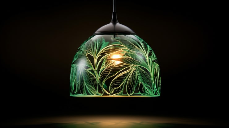
Green Glass Pendant Lights: Stylish Ideas for Elegant Interior Lighting
Green glass pendant lights can add color, character, and a refined decorative touch to an interior while also providing practical illumination. Unlike ordinary ceiling fixtures, pendant lights hang from the ceiling and can become an important part of a room’s visual design. Green glass adds another layer of interest by filtering and reflecting light through a distinctive colored surface. Depending on the shape, shade, and finish, these fixtures can complement modern kitchens, traditional dining rooms, cozy bedrooms, entryways, and contemporary living spaces. They can also be used individually or arranged in groups to create different lighting effects. What Are Green Glass Pendant Lights? Green glass pendant lights are ceiling-mounted fixtures featuring a glass shade with a green tint or finish. The shade may be transparent, translucent, frosted, textured, or colored throughout the glass. The fixture typically hangs from a cord, chain, rod, or metal suspension system. Designs range from small decorative pendants to larger statement fixtures suitable for prominent areas. Green glass can create different effects depending on its intensity. Pale green may provide a subtle decorative accent, while deep emerald or forest green can become a strong focal point. Why Choose Green Glass Lighting? Lighting is not only functional but can also influence the atmosphere and character of a room. Green glass introduces color without requiring paint, furniture, or large decorative changes. The material can also interact with natural and artificial light. During the day, sunlight can highlight the glass surface, while an illuminated bulb can create a warm glow through translucent shades. Green is often associated with nature, freshness, and calmness, making it an appealing choice for interiors that incorporate plants, wood, stone, and other natural materials. Choosing the Right Green Shade The shade of green should complement the room’s existing colors. Soft sage and pale green can create a subtle appearance suitable for minimalist or Scandinavian-inspired interiors. Olive green can provide a warmer, earthy effect, while emerald green offers a richer and more luxurious appearance. Dark forest green can create dramatic contrast against light walls and ceilings. Consider the wall color, cabinetry, furniture, flooring, and other lighting fixtures before choosing the glass shade. A green tone that connects with existing colors will generally feel more intentional. Popular Glass Styles The type of glass can significantly affect the appearance of a pendant light. Clear green glass allows the bulb and interior components to remain visible and can create a light, airy appearance. Frosted glass diffuses the light and produces a softer effect. Ribbed or fluted glass adds texture and can create attractive patterns when illuminated. Handcrafted or irregular glass may provide a more artistic appearance, while smooth glass tends to suit contemporary interiors. Choose the glass style according to both the desired appearance and the type of lighting needed. Green Glass Pendant Lights in the Kitchen Kitchens are among the most popular areas for pendant lighting. Fixtures can be installed above islands, breakfast bars, counters, or dining areas. Green glass can work especially well with white, cream, wood, gray, or dark cabinetry. Several matching pendants can create symmetry above a long kitchen island. For a more relaxed appearance, consider combining green glass with natural wood and warm metal finishes. Make sure the fixture is positioned at a suitable height so it provides useful illumination without interfering with cooking or conversation. Using Pendant Lights Over a Dining Table A dining table provides a natural location for a decorative pendant because the fixture can help define the dining area. A larger pendant can act as a centerpiece, while multiple smaller fixtures can create a more balanced arrangement over a long table. Green glass can complement wooden dining tables particularly well because the combination of natural wood and green creates an organic visual relationship. Choose a bulb color that supports the intended atmosphere. Warmer light can create a comfortable dining environment, while brighter neutral light may be more practical for multipurpose spaces. Green Glass Pendants in the Bedroom A small green glass pendant can provide a decorative alternative to traditional bedside lamps. When installed on either side of a bed, matching pendants can create symmetry. Pale green glass can complement soft neutral bedding, while darker green shades can provide contrast against white or cream walls. Pendant lighting can also free up space on bedside tables, making it useful in smaller bedrooms. Because bedrooms generally benefit from comfortable lighting, consider bulbs that provide a softer and less intense illumination. Using Them in Entryways An entryway pendant can make a strong first impression because it is often one of the first decorative fixtures visitors see. A green glass shade can add personality to an otherwise simple entrance. Larger entryways may accommodate a more substantial pendant, while narrow spaces may benefit from a smaller design. Pair the fixture with a console table, mirror, artwork, or natural materials that repeat or complement the green tone. Matching Green Glass With Metal Finishes The metal finish surrounding the glass can significantly influence the overall style of a pendant light. Brass and antique brass can create a warm, traditional, or vintage-inspired appearance. Black metal can provide stronger contrast and work well in modern interiors. Chrome and polished finishes can create a cleaner contemporary effect, while bronze can complement earthy green shades. When selecting a pendant, consider other metal finishes already used in the room so the lighting fixture feels integrated. Single Pendant or Multiple Fixtures? One pendant can be enough when the fixture is intended to act as a decorative focal point. This approach works particularly well over small tables, reading areas, or compact kitchen counters. Multiple pendants can provide greater visual impact and more even illumination. They are particularly useful above kitchen islands and long dining tables. When using multiple fixtures, maintain consistent spacing and consider the scale of the furniture below them. A group of small green glass pendants can create a different effect from one large statement fixture. Choosing the Right Size Scale is essential when selecting pendant lighting. A fixture that is too
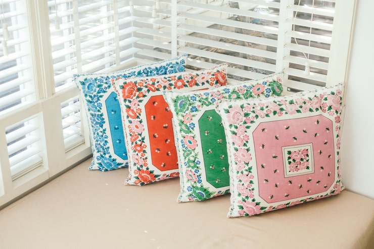
Floral Pillow Covers: Stylish Ideas for a Fresh and Inviting Home
Floral pillow covers are an easy way to introduce color, pattern, and natural character into a home without making major changes to furniture or wall decor. Flowers and botanical designs can create a soft, welcoming atmosphere while giving sofas, beds, accent chairs, and benches a refreshed appearance. Available in countless colors, fabrics, sizes, and patterns, floral covers can suit everything from traditional and farmhouse interiors to modern, cottage, bohemian, and contemporary spaces. Changing pillow covers is also a practical decorating solution because it allows homeowners to update a room seasonally without replacing the entire pillow collection. What Are Floral Pillow Covers? Floral pillow covers are removable decorative covers featuring flower-inspired patterns, botanical illustrations, leaves, vines, or other nature-based designs. They are generally designed to fit over existing cushion inserts, making them convenient for changing the appearance of furniture. Some designs feature large, dramatic flowers that act as focal points, while others use small repeated prints for a more subtle effect. Botanical patterns may also combine flowers with foliage to create a natural and layered appearance. Because the cover can usually be removed from the insert, it is easier to store, clean, and replace than a complete decorative pillow. Why Choose Floral Designs? Floral patterns have a timeless quality that allows them to work across many decorating styles. They can introduce warmth and softness into spaces dominated by plain furniture and neutral colors. Flowers can also bring visual movement into a room. A carefully selected floral pattern can connect different colors already present in curtains, rugs, artwork, or upholstery. Another advantage is variety. Floral designs range from delicate and understated to bold and colorful, making it possible to choose an option that matches almost any interior. Choosing the Right Floral Pattern The size of the floral pattern can significantly affect the appearance of a room. Large flowers tend to create a stronger visual statement and can work well as accent pieces. Small floral prints generally provide a softer and more traditional appearance. They can be particularly effective when several pillows need to be coordinated without creating too much contrast. Abstract floral patterns offer a modern interpretation, while realistic botanical illustrations can create a more natural or classic atmosphere. Consider the size of the furniture and the amount of existing pattern in the room before making a selection. Selecting the Right Colors Color is one of the most important considerations when choosing a floral pillow cover. Look around the room and identify existing colors in the furniture, walls, rugs, curtains, and accessories. A floral cover does not need to match everything exactly. Instead, it can repeat one or two existing shades to create a visual connection. Soft pastels can create a calm and romantic atmosphere, while deep greens, burgundy, navy, or mustard can create a richer appearance. Neutral floral designs in cream, beige, gray, and muted tones can add pattern without overwhelming a minimalist room. Choosing the Right Fabric The fabric can change both the appearance and practicality of a floral pillow cover. Cotton is a popular option for casual interiors because it is comfortable and generally easy to maintain. Linen offers a relaxed natural texture that works particularly well with farmhouse, coastal, and contemporary decorating. Velvet can make floral patterns look richer and more luxurious, while woven fabrics can provide additional texture. For frequently used pillows, choose a durable material that can withstand regular handling and cleaning. Floral Pillow Covers for the Living Room The living room is an ideal location for floral cushions because they can quickly change the character of a sofa or accent chair. A neutral sofa in beige, gray, cream, or white can serve as a background for colorful floral patterns. For a stronger effect, use one or two bold floral covers alongside simpler solid-colored pillows. A coordinated throw blanket, rug, or piece of artwork can repeat one of the floral colors and create a more unified appearance. Avoid covering every seat with large floral patterns if the room already contains several decorative prints. Decorating the Bedroom Floral designs can create a soft and inviting bedroom atmosphere. Light botanical patterns can complement white or neutral bedding, while deeper floral designs can provide contrast against plain sheets and blankets. For a balanced arrangement, place floral cushions in front of larger neutral pillows. This allows the pattern to become an accent rather than dominating the entire bed. Muted pink, sage, blue, cream, and lavender can create gentle combinations, while deeper colors can provide a more dramatic appearance. Floral Covers for Farmhouse Interiors Farmhouse interiors often benefit from natural colors, comfortable fabrics, and relaxed patterns. Floral pillow covers can fit naturally into this style when paired with linen, cotton, wood, and other organic-looking materials. Small botanical prints in muted colors can create a traditional farmhouse feeling. For a more updated interpretation, choose a simplified floral pattern with a restrained color palette. Mixing floral covers with striped, checked, or solid pillows can create the layered appearance commonly associated with comfortable farmhouse spaces. Creating a Modern Floral Look Floral patterns do not have to look traditional. Modern floral covers often use simplified shapes, oversized flowers, abstract leaves, or limited color palettes. A black and white botanical print can provide a graphic appearance, while a single-color floral design can work well in a minimalist room. Pair a modern floral cover with plain furniture and clean-lined accessories to prevent the room from becoming visually crowded. Mixing Floral Patterns With Other Designs Floral pillows can be combined with other patterns when the arrangement is carefully planned. Stripes, checks, geometric designs, and subtle textures can all complement floral prints. The easiest approach is to choose a shared color palette. For example, a floral pillow containing blue and white can be paired with a solid blue cushion and a small striped design. Varying pattern scale is also useful. One large floral print can be balanced with smaller patterns and solid colors. Seasonal Decorating With Floral Covers Floral designs are especially useful for seasonal decorating. Bright flowers
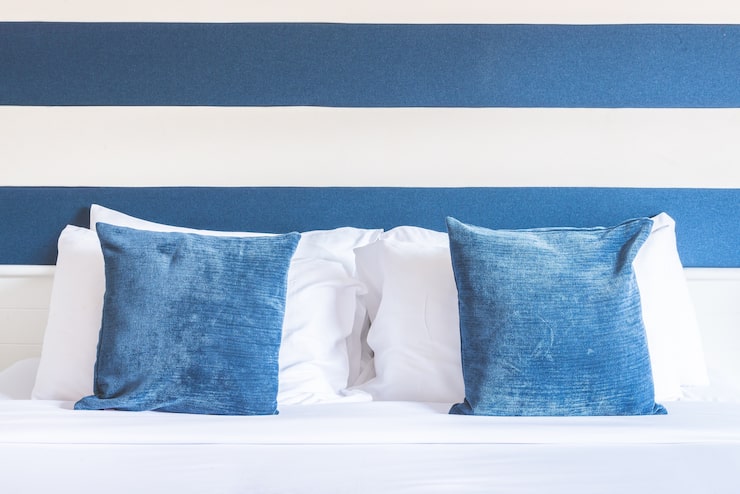
Blue and White Throw Pillows: Stylish Ideas for a Fresh and Elegant Home
Blue and white throw pillows are a timeless decorating choice that can add freshness, contrast, and character to living rooms, bedrooms, reading spaces, and other areas of the home. The combination of blue and white works across many interior styles because it can be adapted from soft and coastal to traditional, modern, or sophisticated. Decorative pillows are also an easy way to refresh existing furniture without replacing an entire sofa or changing the room’s main color scheme. With the right patterns, fabrics, sizes, and shades, blue and white pillows can create a comfortable and coordinated appearance. Why Blue and White Work So Well Together Blue and white create a balanced combination because white provides brightness while blue introduces depth and color. The contrast can be subtle when pale blue is used, or more dramatic when navy or cobalt is selected. This color pairing is also highly versatile. It can create a relaxed coastal feeling, a classic traditional appearance, or a crisp contemporary atmosphere depending on the design. Because both colors can be found in countless shades and patterns, homeowners can easily adapt them to existing furniture and decorative accessories. Choosing the Right Blue Shade The shade of blue has a major effect on the overall mood of the room. Light blue can create an airy and peaceful appearance, while navy provides a deeper and more sophisticated effect. Teal and turquoise can introduce a brighter coastal feeling, whereas dusty blue and muted blue can produce a softer, more understated look. Cobalt and royal blue can create stronger visual contrast and work well when the room needs a noticeable accent. Before choosing pillows, consider the colors already present in the room so the blue feels intentional rather than disconnected. Popular Blue and White Patterns Patterns allow blue and white pillows to complement many different decorating styles. Stripes are among the most versatile options and can create a classic or coastal appearance. Geometric patterns can give the room a contemporary feel, while floral designs can create a softer and more traditional look. Checks, trellis patterns, medallions, abstract prints, and botanical motifs are also popular choices. When combining several patterned pillows, use different pattern scales. A large print can be balanced with smaller geometric or striped designs. Choosing the Right Fabric The fabric affects both the visual appearance and comfort of a decorative pillow. Cotton and linen are popular choices for relaxed and casual interiors. Velvet can give navy or deep blue pillows a richer and more luxurious appearance. Chenille provides softness and works well in comfortable family rooms. Woven and embroidered fabrics can introduce texture without requiring bold colors. For frequently used furniture, select fabrics that are durable and easy to maintain. Decorative pillows used mainly for appearance can accommodate more delicate materials. Blue and White Pillows for the Living Room A neutral sofa can provide an excellent background for blue and white pillows. White, cream, beige, gray, and light brown upholstery can all work well with this combination. On a white sofa, deeper blue pillows can create definition. On a navy or dark blue sofa, predominantly white pillows can introduce brightness. A balanced arrangement can include a mixture of solid colors, stripes, and patterned cushions. Adding a coordinating throw blanket or rug can help connect the colors throughout the room. Decorating a Bedroom Blue and white are particularly suitable for bedrooms because they can create a clean and peaceful appearance. White bedding paired with pale blue pillows can produce a soft and airy atmosphere. Navy pillows can provide stronger contrast against white sheets or a light headboard. Layering pillows in different sizes can add depth to the bed. Larger pillows can provide the foundation, while smaller decorative cushions can be placed toward the front. For a more relaxed appearance, incorporate linen, cotton, or other natural-looking materials. Creating a Coastal-Inspired Look Blue and white are strongly associated with coastal interiors because they resemble elements such as water, clouds, and bright seaside environments. Light blue, aqua, navy, and white can be combined with natural wood, rattan, linen, and woven accessories. A coastal room does not need to rely heavily on nautical decorations. The color combination and natural textures can create the desired atmosphere without anchors, shells, or other themed accessories. This creates a more subtle and contemporary interpretation of coastal decorating. Creating a Traditional Interior Blue and white have long been used in classic interior design. Traditional spaces can benefit from floral, damask, medallion, or intricate geometric patterns. Navy and cream can create a particularly sophisticated combination when used with traditional furniture and natural wood finishes. Decorative piping, embroidery, and textured fabrics can further enhance the classic appearance. The key is to coordinate the patterns rather than using too many competing designs. Creating a Modern Look Modern interiors often benefit from simple blue and white pillows with clean geometric patterns or solid blocks of color. A crisp white sofa can be paired with navy cushions for a strong but controlled contrast. Abstract patterns can also work well in contemporary rooms, particularly when the rest of the furniture has simple lines. Keep the overall number of patterns limited to preserve the clean appearance associated with modern interiors. Combining Blue and White With Other Colors Blue and white can easily be combined with additional colors. Beige and tan introduce warmth, while gray creates a more understated contemporary palette. Natural wood tones work particularly well because they soften the contrast between the two colors. Green can create a fresh botanical atmosphere, while muted yellow can add warmth and energy. Metallic accents such as brass or silver can also complement blue and white, particularly in more formal interiors. Use additional colors selectively so that the primary palette remains clear. Mixing Pillow Sizes and Shapes Different pillow sizes can make a sofa or bed look more layered and inviting. Large square pillows can provide a foundation, while smaller cushions can add pattern and color toward the front. Lumbar pillows can introduce a different shape and provide practical support.
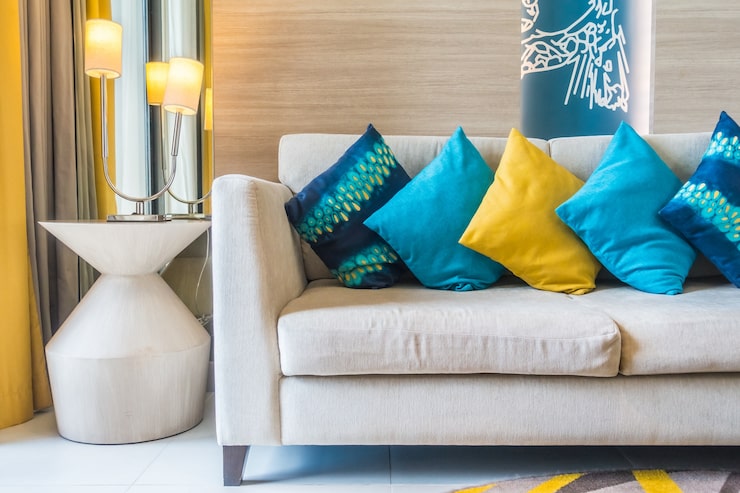
Blue and Green Pillows: Stylish Ideas for a Fresh and Relaxing Home
Blue and green pillows can bring a refreshing combination of color, comfort, and natural character to almost any living space. These two colors work particularly well together because they are commonly associated with water, nature, sky, and greenery. Depending on the shades and patterns selected, the combination can create anything from a calm coastal atmosphere to a rich botanical look or a sophisticated contemporary setting. Decorative pillows are also an easy way to update furniture without replacing larger pieces, making them a practical choice for seasonal decorating and everyday home styling. Why Blue and Green Work Well Together Blue and green sit close to each other on the color wheel, which allows them to create a naturally harmonious combination. Cool blue can provide a sense of calm, while green can introduce an organic and refreshing quality. The overall effect depends heavily on the specific shades. Pale blue with sage green can feel soft and understated, while navy and emerald can create a richer and more dramatic appearance. Because both colors are available in countless shades, they can be adapted to different decorating styles and room sizes. Choosing the Right Shades Shade selection is one of the most important parts of creating a successful blue and green pillow arrangement. Light blue and soft green are suitable for airy interiors and rooms where a relaxed atmosphere is desired. Navy blue paired with forest or emerald green creates stronger contrast and works well in sophisticated spaces. Teal and turquoise can provide a vibrant appearance, especially when combined with lighter green accents. Muted blue and olive green can create a warmer, more earthy look. Consider the colors already present in the room before selecting pillows so that the new accessories feel connected to the existing design. Popular Blue and Green Pillow Patterns Patterns can add personality while helping multiple pillows feel coordinated. Botanical prints are a natural choice because leaves and foliage already connect green with nature. Geometric designs can provide a modern appearance, while stripes create a classic and structured look. Floral patterns can introduce softness, and abstract designs can add a more artistic quality. If several patterned pillows are being used together, vary the scale of the patterns. Combining one larger print with smaller or simpler designs can help prevent visual overload. Choosing the Right Fabric Fabric influences both the appearance and comfort of decorative pillows. Cotton and linen are suitable for casual spaces and warm-weather decorating because they have a light and natural appearance. Velvet can make deep blue and green shades appear richer and more luxurious. Chenille and woven fabrics can provide softness and texture in family rooms. Embroidered or textured pillows can add visual interest even when their colors are relatively simple. Choose materials according to how the pillows will be used. Decorative pillows in frequently used areas should generally be comfortable and durable. Blue and Green Pillows for the Living Room The living room is one of the easiest places to introduce blue and green through decorative cushions. A neutral sofa provides an excellent background because it allows the colors to stand out. On a white or cream sofa, blue and green pillows can create a fresh and bright appearance. Gray furniture can support deeper shades such as navy, teal, and forest green. Wood furniture also pairs naturally with this color combination because natural wood tones help connect the cool colors with an earthy environment. A coordinated throw blanket or rug can further connect the colors throughout the room. Decorating a Bedroom With Blue and Green Blue and green can create a peaceful bedroom environment when softer shades are selected. Pale blue combined with sage, mint, or muted green can produce a gentle appearance. For a more dramatic bedroom, consider navy bedding with emerald or forest green accents. Pillows can be layered in different sizes to create depth. Larger square cushions can provide a foundation, while smaller decorative pillows can add contrasting patterns or textures. Keep the arrangement balanced so that the colors enhance the bedroom rather than making it feel overly busy. Creating a Coastal Look Blue and green are naturally suited to coastal-inspired interiors. Soft aqua, sea blue, muted turquoise, and light green can evoke the appearance of water and natural landscapes. Pair these colors with white, cream, pale wood, linen, and woven textures for a relaxed coastal atmosphere. Avoid using too many nautical symbols if you want a more modern interpretation. Color, texture, and natural materials can communicate the coastal feeling without relying heavily on themed accessories. Creating a Botanical Atmosphere Green is strongly associated with plants and foliage, making it an ideal color for botanical-inspired decorating. Pairing green pillows with blue designs featuring leaves, flowers, or abstract natural forms can create a fresh interior. Houseplants, wooden furniture, woven baskets, and natural fabrics can strengthen this connection. A botanical arrangement does not need to be overly colorful. Different shades of green combined with one or two blue accents can create a sophisticated appearance. Using Blue and Green in Neutral Rooms Neutral rooms can benefit significantly from blue and green pillows because they introduce color without requiring a major redesign. A beige, cream, white, or gray sofa can serve as a neutral foundation. Blue and green cushions can then provide controlled bursts of color. If the room already contains several neutral accessories, choose pillows with different textures to create additional interest. This approach is especially useful for renters or homeowners who want to refresh a room without changing permanent features. Mixing Blue and Green With Other Colors Blue and green can be combined with several additional colors. White and cream provide a clean background, while beige and tan introduce warmth. Brown and natural wood tones can create an earthy appearance. Gold or brass accents can complement deeper blue and green shades in more sophisticated interiors. Yellow can provide energetic contrast, while soft gray can help create a quieter and more contemporary palette. Use additional colors selectively so that the primary blue and green combination remains
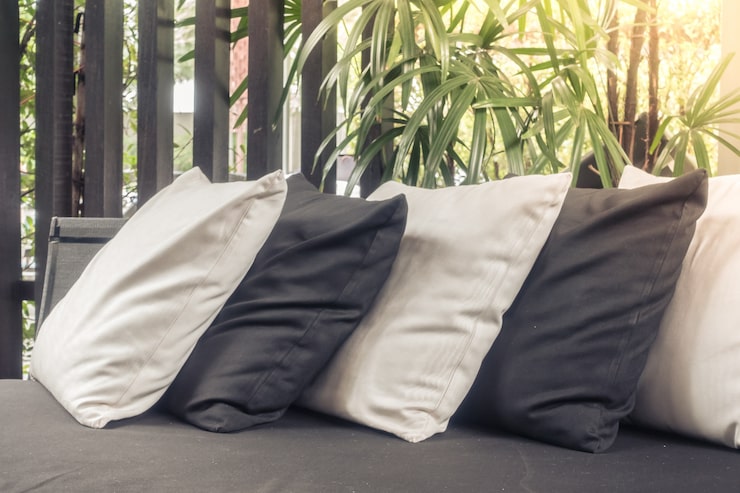
Black and White Throw Pillow: Stylish Ideas for Modern Home Decor
A black and white throw pillow is a simple yet versatile way to introduce contrast, personality, and visual balance into a living space. The timeless combination of black and white works with many interior styles, from modern and minimalist to farmhouse, contemporary, and eclectic. Whether placed on a sofa, accent chair, bed, bench, or reading nook, the right pillow can make a room feel more polished without requiring a complete decorating change. Because black and white can complement almost any color palette, these pillows are also easy to incorporate into existing interiors. What Makes Black and White Throw Pillows Popular? Black and white create a strong visual contrast that naturally attracts attention. Unlike highly colorful accessories, this classic combination can provide character while maintaining a restrained appearance. The two colors can also be used in many different patterns. Stripes, geometric shapes, checks, abstract designs, botanical prints, and simple color blocks can all create completely different moods. Another advantage is flexibility. A black and white pillow can work as a subtle accent in a neutral room or become a stronger focal point when surrounded by simpler furnishings. Choosing the Right Pillow Style The style of the pillow should match the overall atmosphere of the room. A geometric pattern can complement a contemporary interior, while a checked or striped design may work well in a casual or farmhouse-inspired setting. For a minimalist room, a pillow with a simple black border or understated pattern can add interest without creating visual clutter. Eclectic interiors offer more freedom. Different patterns and textures can be combined to create a layered and expressive appearance. The goal is to select a design that supports the room rather than competing with every other decorative element. Popular Black and White Patterns Patterns are one of the easiest ways to add personality to a black and white pillow. Stripes are classic and can make furniture appear more structured. Geometric patterns can introduce a modern appearance through triangles, diamonds, grids, or abstract shapes. Checkerboard designs provide a bold graphic effect. Floral and botanical prints offer a softer interpretation of the color combination, while abstract patterns can create a more artistic look. When using multiple patterned pillows, vary the scale of the designs so that they do not all compete for attention. Choosing the Right Fabric Fabric has a major influence on how a pillow looks and feels. Cotton and linen are popular for casual and relaxed interiors because they provide a natural texture. Velvet can create a richer and more luxurious appearance. Wool or woven fabrics can add warmth and dimension during colder seasons. Textured materials such as boucle, chenille, and embroidered fabrics can make a black and white pillow more visually interesting even when the pattern itself is simple. Consider both appearance and comfort when choosing a fabric, especially if the pillow will be used regularly. Black and White Pillows on a Sofa A sofa is one of the most common places to use decorative pillows. A black and white pillow can create contrast against neutral upholstery such as beige, gray, cream, or white. On a darker sofa, a lighter pillow can provide brightness, while a predominantly black design can add depth to a lighter piece of furniture. Instead of using several identical pillows, combine different shapes, patterns, and textures. A balanced arrangement can make the sofa look comfortable and intentionally styled. Decorating a Bed With Black and White Pillows Black and white pillows can also create a sophisticated bedroom arrangement. They can be layered in front of larger sleeping pillows or placed against a neutral headboard. A black and white design can work particularly well with white bedding because the contrast is clear and uncomplicated. For a softer bedroom appearance, combine black and white pillows with gray, cream, beige, or natural textile colors. This prevents the room from feeling overly stark. Using Them With Other Colors Black and white do not need to be used alone. They can serve as a neutral foundation for other accent colors. Adding muted green can create a natural atmosphere, while warm terracotta or rust can make the space feel more inviting. Blue can introduce a calm coastal or contemporary quality. Metallic accents such as brass or silver can also complement black and white decor. When adding another color, use it selectively so that the black and white elements continue to provide visual structure. Creating a Modern Look Modern interiors often rely on clean lines, controlled color palettes, and carefully selected accessories. A black and white throw pillow can reinforce this aesthetic without requiring major changes. Look for simple geometric patterns, sharp borders, monochrome artwork, or structured textures. Pairing a graphic pillow with a plain sofa can create a strong contrast while keeping the overall design organized. Avoid using too many unrelated patterns because the modern appearance depends partly on visual clarity. Creating a Cozy Look Although black and white can sometimes appear formal, the right materials can make the combination feel warm and comfortable. Soft fabrics, woven textures, fringed edges, and subtle patterns can reduce the severity of a high-contrast palette. Layering black and white pillows with cream, beige, or warm gray cushions can create a cozy arrangement suitable for living rooms and bedrooms. Natural materials such as wood, rattan, and woven baskets can also soften the overall look. Mixing Different Pillow Sizes Using different pillow sizes can make a seating arrangement look more dynamic. Larger square pillows can provide a foundation, while smaller cushions can be positioned in front. Rectangular lumbar pillows can add another shape and provide useful back support. The key is to create variety without making the arrangement appear crowded. Leave enough space for people to sit comfortably. Decorating With Seasonal Changes Black and white pillows are easy to adapt throughout the year because their neutral palette works with seasonal accessories. During colder months, pair them with chunky knit blankets and warm textured fabrics. In spring and summer, lighter linen or cotton pillows can create a fresher appearance. Seasonal
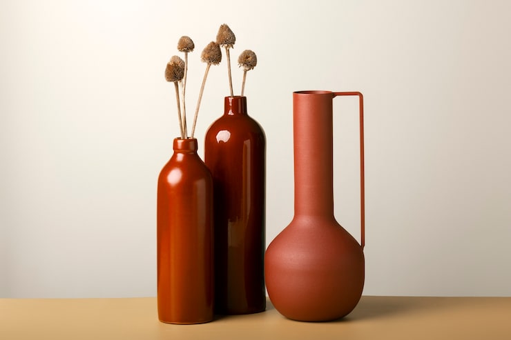
Tall Ceramic Vase: Stylish Ideas for Elegant Home Decor
A tall ceramic vase can instantly add height, character, and visual balance to a room without requiring a major change in the overall decor. Its simple structure makes it suitable for modern, traditional, rustic, minimalist, and contemporary interiors. Whether displayed with fresh flowers, dried branches, decorative grasses, or left empty as a statement piece, a tall vase can become an attractive focal point. Because ceramic comes in many colors, finishes, shapes, and textures, homeowners can easily find an option that complements their existing furniture and decorating style. What Is a Tall Ceramic Vase? A tall ceramic vase is a decorative container made primarily from ceramic material and designed with greater height than standard tabletop vases. Its elongated proportions make it especially useful for decorating areas where vertical space needs more visual interest. These vases are commonly placed on floors, console tables, shelves, sideboards, mantels, entryway furniture, or large open surfaces. Depending on their size and construction, some are primarily decorative while others are suitable for holding water and fresh flowers. Why Tall Vases Are Popular in Home Decor Height is an important element of interior design because it can help create visual balance. Furniture and decorative accessories are often positioned at different heights, and a tall vase can fill an otherwise empty vertical area. Ceramic also provides a substantial appearance compared with lightweight decorative materials. A well-designed vase can add texture and personality without making the room feel overcrowded. Another benefit is versatility. The same vase can be used with different seasonal arrangements or displayed by itself when a simpler appearance is preferred. Choosing the Right Size Size should be considered carefully before purchasing a tall vase. A very large vase can dominate a small room, while a narrow vase may look insignificant in a spacious area. For floor placement, choose a height that complements nearby furniture and leaves enough surrounding space. A vase placed on a console or table should be proportionate to the furniture rather than extending so high that it interferes with artwork, lighting, or other decorative features. The width also matters. A tall, narrow design creates an elegant vertical effect, while a wider base can provide a stronger and more substantial presence. Popular Ceramic Vase Shapes Ceramic vases are available in numerous shapes, allowing homeowners to select a design that matches their preferred aesthetic. Slim cylindrical vases work well in minimalist interiors. Rounded or bulb-shaped designs can create a softer appearance, while tapered styles offer a more architectural look. Some vases feature narrow openings that work particularly well with individual branches or tall stems. Others have wider openings that allow fuller floral arrangements. The silhouette should be considered along with the color and finish because the shape itself can become an important decorative element. Choosing Colors and Finishes Color is one of the easiest ways to coordinate a ceramic vase with an existing interior. White, cream, beige, gray, black, and muted earth tones can blend naturally with neutral decor. For a stronger visual statement, deeper shades or carefully selected accent colors can provide contrast. Matte finishes tend to create a soft and understated appearance, while glossy ceramic surfaces can reflect light and provide a more polished look. Textured finishes may add additional depth and interest to simple rooms. When selecting a color, consider the surrounding walls, flooring, furniture, curtains, and decorative accessories. Tall Ceramic Vases for Modern Interiors Modern interiors often benefit from clean shapes and restrained decoration. A tall ceramic vase with a simple silhouette can fit naturally into this style. Neutral colors such as white, charcoal, sand, or warm gray can complement contemporary furniture without competing with stronger design features. A single vase containing several long branches can provide an organized vertical element. Alternatively, an empty sculptural vase can create interest through its shape alone. Using Vases in Minimalist Spaces Minimalist decorating focuses on simplicity, useful objects, open space, and carefully selected details. A tall vase can work particularly well in this environment because one well-chosen piece can have a noticeable impact. Instead of filling the vase with a large arrangement, consider a few stems or dried branches. Leaving some of the surrounding surface visible can preserve the clean appearance associated with minimalist interiors. The goal is to make the vase feel intentional rather than excessive. Decorating With Flowers and Branches Fresh flowers can transform the appearance of a ceramic vase and introduce natural color into a room. Tall flowers and branches are particularly suitable because they complement the elongated shape. Dried pampas grass, eucalyptus, reeds, willow branches, and decorative grasses can provide a long-lasting alternative to fresh flowers. The arrangement should be proportional to the vase. Extremely short stems may make a tall vase appear unbalanced, while excessively large branches can overwhelm the surrounding space. Using a Vase Without Flowers A tall vase does not always need an arrangement to look attractive. Many ceramic designs have enough shape, texture, or color to function as standalone decorative objects. An empty vase can be useful when creating a clean and uncluttered display. This approach works especially well with sculptural ceramic designs. Displaying the vase alone also makes it easier to change the room’s appearance without regularly purchasing flowers or replacing dried arrangements. Placement Ideas Around the Home Entryways are excellent locations for tall ceramic vases because they often contain unused vertical space. A vase placed beside an entry console can create an inviting first impression. Living rooms may benefit from a vase positioned beside a cabinet, fireplace, sofa, or reading chair. In dining areas, a large vase can add height to a sideboard. Bedrooms can use smaller versions on dressers or consoles, while spacious hallways can accommodate larger floor-standing designs. Always leave enough space around the vase so that it does not become a practical obstacle. Creating Balance With Other Decor A vase should work with the other objects around it rather than appearing disconnected. Pairing a tall vase with shorter decorative pieces can create an appealing variation in height. For example, a tall